Factors to consider on page layout for your tour business website

Page layout for your tour business website
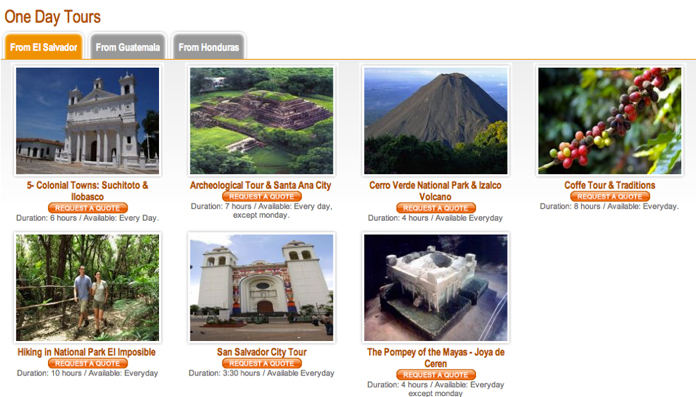
We need to put focus on our website page layout for your tour business website, this includes how wide and how long the web page should appear. In many instances we need not make your page layout longer than one screen scroll due to the fact our website users do not wish to scroll on to the next pages outside the first screen. In tour operations, we believe in writing a lot but we advise you to follow the 5 principles below in ensuring your web page layout meets the needs of the users or your audience.
- Ease of comprehension or understanding: Be very observant that readability is key and that your web page content is easily understood, here we try as much as we can to avoid the use of industry jargon. Your website users must understand what you are laying on your website pages.
- Order items in importance: Priority should be followed and consider the placement of items that users like to look for first before placing those items that users are not interested in. Ensure your contact email and number are placed on the top right-hand corner of your website, your website logo top left corner, and mind where to place your social media handles among other content but priority must be followed. On your safari tour website selling Uganda & Rwanda Tours, the header menu or the Navigation Header menu must run or follow this order in respect to your services and safari products you stand to present to your website users (tourists).
Order with priority: Home, Uganda Safaris, Gorilla Tours, Rwanda Safaris, Wildlife Tours, Bird watching Safaris, Day Tours, Car Hire, Contact US
Order with less priority:- Home, Travel Information, Ticketing, Safaris, Visas to Uganda, National Parks, Hotels, About US, Inquires. Looking at the eye tracking results, the header navigation menu is not only the first but also the most visible section of any website meaning what must run in this section must be of the highest priority amongst your products or safari information from those with less or no priority. - A moderate amount of white space: Always in website development, the amount of white space must be regulated r minimized. The use of a cool friendly background color is ideal over the white background. Be mindful of choosing the right background in comparison with the text color you intend to apply.
- Appropriate line lengths: The use of short meaningful sentences is recommended in the page layout for your tour business website. Avoid long sentences and sometimes lose track of what you are talking about. Proper and simple English writing must be exhibited and industry jargon must be kept away from it
- Appropriate page lengths: Keep the pages short, this is key in Page layout for your tour business website. Avoid more than 3 or 4-page scrolls. The longer the page length, very few users are attracted to concentrate and read the content while keeping the page short, this attracts online readers to your safari tour website. Deciding on an optimal page length is very important. In most cases, long pages cause the information to be hidden, and your website users never find them. 10 people will finish off the first page, 4 makes it to the second page, and one 1 might get to the third page or drop off and the entire message on the other pages will not be consumed.
- Avoiding long page scrolls: This is a common practice in content writing, use of text links. These give access to very useful information on another shorter page created, please refer to Wikipedia content regarding the use of text links. Secondly use of images, a single image represents a thousand words of text. Images are good for visual and comparing purposes as opposed to reading a lot of text.


